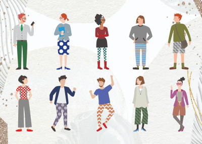
按流行标签浏览免费 图标 矢量、剪贴画和插图
ACworks 彩的图标类别的免版税插图
2. - 在 由于创作者在投稿时一般都会为向量图中的内容添加注释(标签),因此这种搜寻方式可以经典的囊括大部分免费向量图,并将含有检索关键字 如果您不想使用默认的热度排序,可以尝试下一项搜寻功能。
因此,通常情况下,我们默认选择按插图 但如果您希望获得最新的素材,我们也有为您准备相关的功能。只要勾选页面侧边的精致化搜寻栏中的【排序方式】 这也是您偶尔会在 如果您反感此类搜寻结果,则可以利用同样位于精致化搜寻栏中的【排除关键字】,对那些不希望看到的内容进行排除。在上述的情况下,只要您排除 本功能支持同时排除复数个关键字 不过要记得用逗号将这些次隔开喔。 但是,对于搜寻图标类别时,则并非如此绝对(甚至可以说非常有用)。毕竟一部分的图标毛色甚至是固定的。通过颜色搜寻,可以很轻易的限制搜寻结果的展示范围。除此以外,在为与文章或网站寻找颜色相称的图标插图 在这种设定之下,在图标类别中试图按人数搜寻就显得非常无趣。但凡事也并无绝对。比如说,如果您希望找到表现 此时,您大概率会看到人与图标共存的插图 诸如此类,在某些特定情况下,按人数搜寻能帮助您快速缩小搜寻范围。 该功能又会根据介面的不同分为两类。- 此时,尽管类似向量图的种类会发生变化(即插图和剪影),但换个角度想,这些全新的素材类别也为您提供了更多的选择空间。
- 该功能是通过 通过点击特定的插图 这些插图 构图相似而风格迥异的免版税插图 如果您暂时找不到完美的插图,不如点开最接近理想状态的一份向量图。说不定里面就包含着更精彩的推荐!
3. 觉得编辑时找到的图标素材还得先下载再导入才能编辑很麻烦?在 对于每张插图 哪怕不进入各图的下载界面,您也可以通过点击光标悬浮于插图 跳转完成后,您无需执行任何额外操作,被选择的素材将会被自动加载于画布上,供您直接编辑。小到向量图反转 并且最重要的一点:这些都是免费的!4. 为了适应不同的使用目的,我们为您准备了 在下载前,您需要首先完成免费帐号的注册和登入。在实际使用时,您不需要引用出处,并且可用于商业专案。因此,您完全可以将心仪的高质量、免版税的插图
但是,对于搜寻图标类别时,则并非如此绝对(甚至可以说非常有用)。毕竟一部分的图标毛色甚至是固定的。通过颜色搜寻,可以很轻易的限制搜寻结果的展示范围。除此以外,在为与文章或网站寻找颜色相称的图标插图 在这种设定之下,在图标类别中试图按人数搜寻就显得非常无趣。但凡事也并无绝对。比如说,如果您希望找到表现 此时,您大概率会看到人与图标共存的插图 诸如此类,在某些特定情况下,按人数搜寻能帮助您快速缩小搜寻范围。 该功能又会根据介面的不同分为两类。- 此时,尽管类似向量图的种类会发生变化(即插图和剪影),但换个角度想,这些全新的素材类别也为您提供了更多的选择空间。
- 该功能是通过 通过点击特定的插图 这些插图 构图相似而风格迥异的免版税插图 如果您暂时找不到完美的插图,不如点开最接近理想状态的一份向量图。说不定里面就包含着更精彩的推荐!
3. 觉得编辑时找到的图标素材还得先下载再导入才能编辑很麻烦?在 对于每张插图 哪怕不进入各图的下载界面,您也可以通过点击光标悬浮于插图 跳转完成后,您无需执行任何额外操作,被选择的素材将会被自动加载于画布上,供您直接编辑。小到向量图反转 并且最重要的一点:这些都是免费的!4. 为了适应不同的使用目的,我们为您准备了 在下载前,您需要首先完成免费帐号的注册和登入。在实际使用时,您不需要引用出处,并且可用于商业专案。因此,您完全可以将心仪的高质量、免版税的插图
该功能又会根据介面的不同分为两类。- 此时,尽管类似向量图的种类会发生变化(即插图和剪影),但换个角度想,这些全新的素材类别也为您提供了更多的选择空间。
- 该功能是通过 通过点击特定的插图 这些插图 构图相似而风格迥异的免版税插图 如果您暂时找不到完美的插图,不如点开最接近理想状态的一份向量图。说不定里面就包含着更精彩的推荐!
3. 觉得编辑时找到的图标素材还得先下载再导入才能编辑很麻烦?在 对于每张插图 哪怕不进入各图的下载界面,您也可以通过点击光标悬浮于插图 跳转完成后,您无需执行任何额外操作,被选择的素材将会被自动加载于画布上,供您直接编辑。小到向量图反转 并且最重要的一点:这些都是免费的!4. 为了适应不同的使用目的,我们为您准备了 在下载前,您需要首先完成免费帐号的注册和登入。在实际使用时,您不需要引用出处,并且可用于商业专案。因此,您完全可以将心仪的高质量、免版税的插图
4. 为了适应不同的使用目的,我们为您准备了 在下载前,您需要首先完成免费帐号的注册和登入。在实际使用时,您不需要引用出处,并且可用于商业专案。因此,您完全可以将心仪的高质量、免版税的插图
The Popularity of Icons or Vector Icons in the Digital World
An icon is a pictogram or ideogram which can be seen on a computer screen that helps the user navigate a computer system. It is a small graphical representation of a program or file. Doubling clicking an icon, we can open the associated file or program. They are the components of GUI operating systems, including Apple macOS X and Microsoft Windows. Icons help users to recognize the file represented by it quickly. We all know that images are worth a thousand words, so are icons. Icons can not only draw attention, but it also helps you structure content and different functions or services.
Vector icons are fancy in a presentation, making it more presentable. In simple words, vector icons communicate more than simple text. Icons also create a new perception in the viewer whereby they are involved fully in the presentation.
One of the reasons icons have gained massive popularity is because they are designed for almost everything. This style is generally everywhere, from app icons to app-style icons for favicons or desktops icons. App-style icons are a distinct style that almost has their own. Designers are more familiar with choosing icons rather than text because it takes less space. As we live in growing mobile devices with limited screen space, icons are helpful, so designers prefer them. Icons are not needed to be translated and are more familiar to people than text.
Definitions and different types of icons
To choose the best icons, you first need to know about the types of icons and their impacts and uses. There are three types of icons to date, they are:
- Universal Icons
By definition, an icon is a visual presentation of action, idea or object. Only a few icons have got universal recognition from the users. For example, the home, shopping cart, magnifying glass for search, the envelope of mail, and print icons are many people familiar with. Moreover, universal icons are rare. Many are still vague to users outside of the icons above due to their multiple meanings across interfaces.
- Conflicting Icons
Another type of icon that might cause trouble when executed with a standard pictogram is those with opposite meanings—for example, the hamburger icons for navigation. Most people use it as a scrollable overlay, while others represent a list. Conflicting icons confuse users because of their different meanings. Users expect different results and get a different one which is troublesome for them.
- Unique Icons
Unique Icons function far away from standard actions like sharing and printings. Many designers fail in this category because these icons are typically challenging to recognize. These icons can be entirely different for first-time users. Some will find them interesting and be willing to learn them, while others don't have that much time. Vector icons tell the users what they want to do without much effort.
How to create suitable icons for different uses?
Almost all the things are about creating app design nowadays. Icons are the minor features of every app that represent it on the screen of every mobile phone device and in the app stores. Using great icons is more than just putting simply a logo in a box. Your icons need to stand out among all the other app icons available.
A sound icon is used for various purposes like apps, social media and even on smaller printed projects or business cards. And all it takes is a little thinking, design and time.
There are various ways to create suitable icons and vector icons that are used differently, they are:
- Make it easy to read
Here, easy to read doesn't mean text. Visual legibility should be the key. The icons should consist of visuals that are recognized worldwide. For example, icons on your computer's desktop, music are played from a button in the form of a musical note, documents are stored in folders, images should be kept in a place that looks similar to a polaroid photo, etc. You can quickly know where things are saved because of the simple icons.
When it comes to visuality, branding is a vital part of the consideration. Big brands often have ions that are a part of their logo or an iconic image. People are more familiar with it even at smaller sizes.
- Think Icons, not image
Icons are not a photo in a box. An icon can consist of an image and can be a text representation or combination of logomark elements. It should be highly visual and identifiable. Almost all logos do not include actual photos but are more graphic representations of an idea. Furthermore, this concept highlighted the need to make a vector-based icon.
People find it challenging to read images at smaller sizes and get lost easily in a sea of other icons on a user's phone. Hence, a more graphic representation solves this problem.
- Use Vibrant colors
Do you want your icon to stand out? If yes, then use bold colors. A vibrant color choice will help your app stand out on various backgrounds and gain users' attention. You also need your icon design to blend in with all the other options available. Colors like blue, especially the sky, and navy blue should be avoided because many other icons with these colors are already available. Let's think your primary brand color is blue, then try to pair that with something brighter for impact. So, consider using a new neutral like lime green or seasonal hue such as bright orange or pale pink in the spring, etc.
- Avoid words
One thing you don't want to see in icons is words. In simple terms, there is not enough room in the icons to fill it with stuff to read. It would be best to avoid text unless it is part of your brand logo. Even text is the part of your logo, and you should be careful while considering it before using that in your primary logo design. Always try to design your icons that can be identified without any words.
For example, The Design Shack icon uses only a single letter, 'd', with color and type treatments consistent with the website. Therefore, these are easy to read and help create a visual connection without words.
- Create in a Vector Format
The format is an important consideration when it comes to scale and size. Icons should be created using vector-based design. Having vector icons-images means we can save the icons for various devices, sizes, and viewports without making a lot of individual images. Because in reality, you need multiple versions of icon size for a variety of projects. Flexibility is the benefit of using vector icons, but there is a catch. You need to save a copy in a non-vector format for many applications or platforms to upload.
- Think Outside the Design Box
There are a lot of icons that use single color backgrounds with a white icon, flat ensign techniques and long shadows. Though these trends can be fun and exciting, don't get stuck inside the design box. Try doing something different with your icon.
If there are a lot of square edges icons, consider making your icon rounded. To stand out from all the flat colors, add a hint of texture to the background. It might be risky trying something different and new, but a famous saying is no pain, no gain. Therefore, don't model your icon on whatever else is doing.
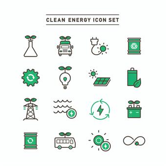
Popular types of Icons or Vector Icons on illsutAC
There are various types of icons and vector icons available to date. illustAC is where you can get thousands of free icons and vector icons of high quality. It also provides you with the search through option. The search filter given by illustAC is one of the best services that allows users to search the vector icons according to their needs like shapes, sizes, colors, etc. Some of the most famous icons and vector icons that illustAC provides for free are flat icons or vector icons, materials icons, social network icons, pictogram icons, line icons, people icons, and many more. Hence, if you search for high-quality free vector icons, illustAC is your destiny. It provides you with the correct icon or vector icon you search for within seconds or minutes.
How to use icons effectively?
Designing icons or vector icons both can bring a lot of fun. Icons are miniature links for Facebook or Instagram; they can also have interactive cues that help us design and provide an extra visual spark. Icons can be of many sizes, shapes, and colors like small or big, black or white, flat or intricate. No matter what style attracts you, the effective use of icons can boost usability and the aesthetic value of every design project.
For Web and Mobile UI
No matter how familiar you are with icons or vector icons on web designs, it is never wrong to review the basics. Many web designers use icons or vector icons for the wrong reasons, thinking that their appearance might help dress up otherwise drab looking sites. Icons deserve more credit. The icons for any specific task will give a particular idea or function. For example, the universal 'envelope' icon everyone knows what that means: e-mail, the regularly used 'wrench' icon is quickly associated with tools. Icons bring quickness to a website that limits reading and speeds up procedures. People having a web design career must see things with fresh eyes.
Think about people who do not read English and will know a website. One of the best ways to know whether the icons you're using adequately express their features is to watch them through the eyes of someone who does not know how to read English. Many websites get into trouble implementing icons with features and details that are not noticeable. So, always try to pay attention to the design of icons and ensure that they are simple and easy to understand. While making your hero easily scannable, make sure that the image you are using matches the concept you are trying to convey. For example, anyone can understand the magnifying glass icon is for search. If there were a desk image rather than a magnifying glass, that wouldn't make sense at all. It will just confuse audiences. Your icons should look like the same artist designed them. Look beyond the design already available and think differently. A beautiful different icon can engage more people rather than guide visitors to the proper functions. Little investment of time and refreshment in icons becomes synonymous with a company's brand that will gain a massive involvement of people. Therefore, this should be the goal while brainstorming and developing icons.
The animation used to have both a clear functional purpose and delight users. So, it is possible to use energy to make a more dynamic experience for cases like state changes. Icons must be better targets for users. One of the most common mistakes among mobile UI designers is leaving too little space for icons on mobiles. When you make a design for touch, make sure that your icons are large enough to be touched with fingers easily. Consistency is the critical point in the design. Icons or vector icons should have visual unification. The icons or vector icons you are using for the product should have the same style. Ideally, they should look like the creators are the same artist.
For Graphic Designs
Not every picture will be an incredible landscape, and they might fall short sometimes. Try adding fun interest to your icon design. Use icons to start the photo's content, give extra information, and provide an interaction cue. Not every icon fits into specific placements to encourage user interaction. Icons or vector icons can be the way of an element to start interactivity. For letting you move your icon across the screen, pair iconography and parallax scrolling. Try creating an aspect that's a bit unexpected by layering icons with images or another background. Your icons don't need to have static elements; animate them. But don't be over excited and crazy.
The best icon animations can relate to the content icon itself. Movements shouldn't be too fast because that may be enervating and not too slow cause users might miss them. Hence, there is a sweet spot in the middle where icon movements provide a bit of delight. Clusters of exciting shapes, sketches or hand-crafted icons can also create an interesting visual. The concept is quite late on websites that distribute icon packs though it has a broader application. You can think outside the box using clusters icons and be more creative.
You can also start with an icon pack if you like and customize icons to create them your own. Either option can also be fun and exciting, allowing you to try something different. For a project, icons or vector icons should be only part of a design strategy. Also, think about your content and pair iconography with trendy elements to create a modern and fresh aesthetic. Style flexibility is one of the most incredible things about using icons or vector icons. For some icons, there are standard designs that you want to use so that your users will know what those elements do.
This might consist of icons for social media links, searches, shopping carts, and navigation arrows. And, also never sacrifice usability for a new design. So, you can add your whimsical twist to these standard icon tyles. You can change the shape, color, tweak or even redraw the icons in your style. The only trick is to do something that feels different and unique while maintaining visual recognition, not questioning the icons. These simple changes can make your icons go a long way. These adjustments can help elements become part of your design and a visual story.






















































 © 2011 - 2024 ACworks Co.,Ltd. 版权所有。
